
Order Maestro
Adding new features to aid users in inventory management and quicker ordering.
ROLE:
UX Designer
PLATFORM:
Desktop web (with new Tablet + Mobile extensions)
DURATION
15 Months
2-Week Agile Sprints
Project Overview
Order Maestro is iTradeNetwork’s B2B e-commerce platform for managing food-service procurement and inventory. Designed primarily for small, fast-food and airport-based operators, it streamlines the procure-to-pay cycle—helping users stay compliant with contracts, manage end-point inventory, and maintain supplier relationships.
When I joined, the product faced significant adoption and retention challenges: only 12 active customers and a 36% drop in recurring revenue. User feedback pointed to outdated UI, unreliable offline capability, and a lack of visibility into orders once staff left their desks. Working as the UX Designer on a team of eight under the VP of Design, I focused on modernizing the experience through research-driven design—introducing mobile and tablet functionality, simplifying search and inventory tasks, and adding new features such as recurring and holiday order automation to reduce user burden.
Summary

Problem
Low adoption and poor usability caused declining revenue and frustrated operators unable to manage orders on the go.
Approach
Conducted user interviews and usability studies, refreshed personas and journey maps, and redesigned key workflows for tablet and mobile. Added recurring and holiday order automation for flexibility.
Result
A modernized, mobile-ready experience that re-engaged existing clients and positioned iTradeNetwork to scale adoption with new distributors.
The Problem
What Happens When the Tools Don’t Match the Pace of the Work?
In this section:
The Challenge
Key Pain-Points
Business & Design Objectives
What Happens When the Tools Don’t Match the Pace of the Work?
In this section:
The Challenge
Key Pain-Points
Business & Design Objectives
The Challenge
By the time I joined the Order Maestro team, the product was losing traction. Despite being part of iTradeNetwork’s suite of supply chain solutions, the platform had just 12 active customers and had seen a 36% drop in recurring revenue. Both users and the internal sales team described the interface as outdated and cumbersome. Operators, many of whom work in small, fast-food environments or at airports, struggled to manage orders and inventory because the tool was limited to desktop use, had unreliable offline functionality, and offered minimal search capabilities.
The VP of Design tasked our team with modernizing the platform experience to help iTradeNetwork regain customer trust, reduce churn, and expand adoption. The immediate goal was to improve day-to-day usability and introduce mobile and tablet support for staff who are constantly on the move. Long-term, the initiative aimed to create a scalable foundation for new features—such as machine-learning-driven recommendations—and align the interface with iTN’s evolving design system to improve developer efficiency and visual consistency across the product suite.
Key Pain Points

Business & Design Objectives
Short-Term
Launch a tablet and mobile version of Order Maestro to support staff working away from desks.
Improve search and inventory workflows to reduce task time
Refresh UI using modern design system components for consistency and faster development
Reduce customer churn by improving user satisfaction and usability
Long-Term
Strengthen iTN’s competitive position by offering a more modern, user-friendly platform.
Equip sales teams with a product that drives confidence and adoption
Introduce intelligent features like purchase-frequency suggestions and promoted-item guidance
Business & Design Objectives


Customer Partnership & User Validation
In this section:
Insights from our top client
Personas & Empathy Maps
Validating Our Assumptions
Comparing Industry Leaders
Insights from our top client
To ensure we were solving the right problems, our design team met with one of our top customers—a multi-location operator who relied heavily on the desktop version.
During this session, we learned that mobility wasn’t just a nice-to-have; it was mission-critical. Their staff spent most of their time away from computers, making it impossible to update orders or view inventory in real time.

Key insights from this meeting:
Mobility gap: “Our teams need to manage orders while they’re on the floor—not after the shift ends. Mobility isn’t a feature; it’s an operational necessity.”
Offline reliability: “Connectivity shouldn’t determine productivity. If Wi-Fi drops, the work still needs to continue.”
Ease of use: “We can’t afford downtime for training. The system has to be intuitive enough that staff can pick it up and go.”
Visibility: “We need immediate confirmation that an order went through—waiting until the next day to find out is unacceptable.”
Before diving into design, I needed to understand why food service operators weren’t adopting Order Maestro. Were we solving the wrong problems—or just making the right ones hard to use? Based on existing interviews and empathy maps, I identified the two primary user types who would benefit most from the added mobility function.
Single Unit Managers and Multi-Unit Managers. Both roles shared similar goals but faced distinct operational challenges that shaped our design focus.
Personas & Empathy Maps

Needs the System To:
Forecast what needs to be ordered and autogenerate the order to save time and focus on other tasks.
A system available on a Tablet that includes an order guide and the ability to scan inventory items to add to an order.
When items on the shopping list are discontinued or out of stock, offer replacement suggestions and/or switch them.
The ability to make changes to a delivery on the fly without having to track them manually.


Needs the System To:
Ability to have a shared shopping cart. So I can see which users have already added the items to the shopping cart.
Needs a better product search across all distributors for each unit. Ability to type the abbreviation, such as choc instead of "chocolate", and still get results.
Needs transparency into total orders across the organization and enterprises.
Needs transparency into total orders by each distributor for each unit.

Validating Our Assumptions
With these user profiles in place, we conducted brief validation sessions with three existing customers to confirm that our synthesized pain points aligned with their real-world experience. These conversations reinforced the same core needs we had uncovered through prior research—mobility, offline reliability, and faster, more intuitive search.
From the empathy maps and user interviews, we found that:
Both personas relied heavily on paper notes and manual data transfer, creating error-prone workflows.
Frustration peaked when connectivity dropped mid-task — any lost data meant starting over.
Search was a recurring source of friction. Users often had to know exact product names or codes (“CHIX” vs “CHKN”), slowing down ordering.
Users wanted reassurance and control — to see that their order was placed and approved, while having the ability to make changes and verify fulfillment status.
The feedback also highlighted a broader expectation: users wanted the system to “just work like the tools they already use.” This insight prompted us to look beyond direct competitors in the food-service space and examine adjacent e-commerce platforms to understand what intuitive ordering and inventory management could look like.
Comparing Industry Leaders
To understand how other ordering and procurement platforms approached similar challenges, we ran a quick comparative analysis of key competitors and adjacent e-commerce tools. We looked at platforms like MarketMan, OroCommerce, Brightpearl, Amazon Business, and our own Order Maestro.
The review confirmed that while most competitors supported mobile workflows, few offered offline inventory, barcode scanning, or recurring automated orders—features that would directly address our users’ most significant pain points.
These insights validated our design direction and helped us focus on differentiating Order Maestro through reliability and real-world usability rather than just visual refresh.
Competitive Snapshot (high-level)
| Features | MarketMan | OroCommerce | Amazon Business | Brightpearl | Order Maestro |
|---|---|---|---|---|---|
| Mobile support | Y | Y | Y | Y | Y |
| Offline inventory | N | N | – | – | Y |
| Advanced search | – | Y | Y | Y | Y |
| Recurring / bulk orders | – | Y | Y | Y | Y |
| Custom catalogs / pricing | N | Y | Y | Y | Y |
| Barcode scan | – | N | Y | – | Y |
| Modern, unified UI | – | Y | Y | Y | Y |
What We Learned
Match consumer-grade speed and simplicity by streamlining search and checkout flows.
Close the mobility gap through an offline-capable experience optimized for tablets.
Leverage automation to reduce repetitive ordering and improve accuracy.
Modernize the interface to build trust and align with iTradeNetwork’s new design system
Approach
Conducted User Interviews with our current users to understand better their workflow, goals, needs, and pain points.
Researched Competitors to understand their strengths and weaknesses in comparison to our solution and to find a gap in the market. Analyzed some consumer-based e-commerce solutions, which are not our direct competitors, to get more comprehensive information and valuable insights on features that can be beneficial for our app (made competitive and comparative analysis)
Created an Empathy Map to gain a deeper insight into our users. To understand what they think, do, say, and what emotions they experience, and what they fear and gain while using our solution.
Spoke to our development team to better understand what the Technical Restrictions are
Made my focus to create a solution that will help our users to do their day-to-day work tasks on the go because they spend 75% of their work time running around their facility
Did some research on how much time mobile B2B e-commerce solutions save for our users
Presented New Mobile and Tablet solutions to our current customers to gain feedback
Made Iterations based on users' feedback and test results
Design Decisions & Usability Testing
In this section:
Low-Med Fidelity Wireframes
Refining Through Feedback
Next iteration
Prototype
Usability Tests Structure
Building on our research, we focused on simplifying the ordering experience while making it accessible anywhere. The redesign introduced mobile and tablet apps to support offline inventory mode, mobile order receiving, and order transparency, all directly tied to the pain points uncovered earlier.
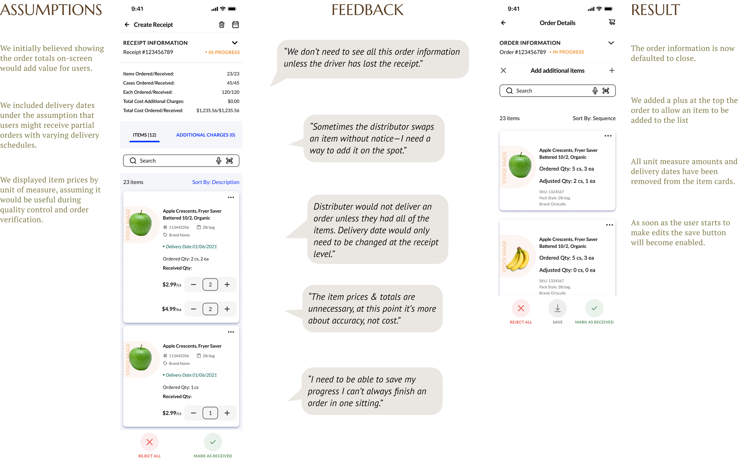
This case study underscores a pivotal capability within the mobile inventory feature: order receiving at the loading dock. By implementing a receiving feature on iPad and mobile devices, users can meticulously review orders as they arrive and either reject specific items or the entire shipment. This enhancement delivers immediate control and ensures full transparency throughout the receiving process, streamlining operations and elevating accuracy.
Low Fidelity Wireframes
During the receiving process, I expanded on existing wireframes, such as the homepage and item cards. This maintained consistency, enabling me to refine user flow and clarity. Using proven designs ensured intuitive navigation and efficient iteration, resulting in a polished, cohesive experience that aligned with the design system.

Refining Through Feedback
Early feedback allowed us to refine the flow and terminology before investing in high-fidelity visuals. These iterations not only improved clarity but also ensured the mobile and desktop experiences felt consistent and intuitive.


Next Iteration

OKR’s
Objective:
Develop mobile and tablet applications so users can do their work on the go
Key Results:
Set up user interviews to better understand users’ needs, goals, and workflow processes and identify pain points
Analyze competitors to understand the reasons why our customers choose them over iTN
Conduct usability studies of new mobile and tablet versions to measure the satisfaction rate
Collect customer feedback and do additional iterations of the designs
Start the development process and launch our mobile and tablet applications
Prototype
UX Challenges
To make the transition from old designs to new designs as smooth as possible, because users don’t like change. They require effort to make, and people don’t know what to expect from changes. Why People Don't Like Redesigns
Measuring success metrics for inventory management using a desktop application versus a mobile application is a challenging task. We need to capture not only the time users spend on entering the remaining quantity of each inventory item into the system, but also the time they spend in their physical locations looking for those products. If we can complete the first part of the task using our prototypes and measure the time, the second part is impossible because we won’t be able to observe the users without being present with them.
We have multiple viewports, including phone, tablet, and desktop. All of them are equally important. It requires a significant amount of QA effort to ensure everything works correctly.
Limited database of item images. Based on our user interviews, we found that item images are one of the key factors influencing purchase decisions. It helps the users to find desired items faster, and it gives an understanding of what the item looks like (packaging, colors, etc). And it’s just more appealing than “No Image” icon - Why Images Are Important In E-Commerce.
Limited resources and short deadlines. All of the OrderMaestro customers are large bureaucratic enterprises. Scheduling user interviews has to happen sometimes multiple weeks in advance, adding huge amounts of time to the design process and the corresponding feedback cycle. B2B software and proprietary collateral are hard to find online legally. We are limited in knowing our competitors’ feature sets because we have to build them from their press releases and publicly available collateral.
Usability Tests Structure
While I wasn’t directly involved in testing the specific wireframes I created, I did lead usability studies for the tablet and web versions of Order Maestro. We used the testing platform’s built-in user pool to recruit participants by filtering for job titles and responsibilities that matched our target audience—primarily ordering managers, chefs, and multi-unit operators.
Each participant was asked to complete a set of defined tasks that reflected key workflows, such as updating inventory, placing orders, and reviewing deliveries. The results were then synthesized to identify friction points, measure task efficiency, and validate the clarity of new interface patterns.
These studies provided us with measurable insights into how real users navigated our designs, which directly informed our iteration cycles and guided the structure of later feedback sessions for the mobile release.
UX Solutions
Mobile and Tablet Apps. Now users can do all their day-to-day tasks on the go.
Elastic Search. It allows fuzzy searching, so users never have to remember the exact product description to find it across all order guides/catalogs.
Barcode Scan. Using our mobile and tablet solution, users can easily scan the product barcode, locate it across all order guides, and add it to their shopping cart.
Offline Inventory Mode. Taking inventory became so easy because even without service, the user can still navigate all inventory locations and enter the remaining quantity, which is saved and synced automatically after service is restored.
Notifications. With our pop-up notification feature, users will always have visibility into the status of their orders. Substitutions, out-of-stock items, order status changes, announcements, and any other important information will be available to the user through the notification center whenever they go to it.
Looking back
Next Steps:
Collaborating with developers to identify any technical limitations that could impact the proposed features or workflows.
Running targeted usability studies to determine whether the swiping interactions feel natural and efficient for users.
Launching the new tablet and mobile applications, followed by structured feedback sessions to capture post-launch insights.
Addressing content gaps such as missing or inconsistent product images and incomplete product details, which currently limit the flow’s overall accuracy and visual consistency.
Lessons:
This project reinforced the importance of grounding design decisions in context, not assumptions. Even familiar workflows revealed hidden friction once we observed how users actually worked—away from their desks, juggling multiple tasks, and often offline.
I also learned the value of balancing innovation with familiarity; keeping established terminology and visual patterns from the desktop version made the mobile experience feel instantly usable without additional training.